Increasing Completion Rates with Better Data Visualizations
Somewhere along the timeline of your students’ learning experience, a disconnect occurred between your intentions and what your students received. Engaged and inspired students don’t voluntarily leave their courses short of completion. Even struggling learners are unlikely to abandon their investment of time and money because they’ve encountered a few poorly worded questions on a quiz. If you are a CME director looking for answers for failing course completion rates, you’ll need much more than statistics—you’ll need data-driven insights. And that means in-depth data exploration— an examination of not just the outline of the disconnect (such as certain percentage of your students dropped out before the halfway mark of your course) but also the meaning hidden within your data—the context, patterns, and relationships that reveal the clues you need to create evidenced-based decisions.
How to Use Data Visualizations to Dig Deep Within Your Data
You’d be forgiven for thinking that “data visualization” is just a clever rebranding of what could be accomplished with a whiteboard and a marker—quick summary of relevant facts accompanied by a helpful arrow or two. However, an advanced data visualization—the kind that you will find in an enterprise-grade analytics suite—does much more. Here are some of the key differences:
An advanced data visualization reveals:
Context
When you can connect new information (20% of our learners are leaving the course after the second quiz) with historical data (before we changed the quiz format, only 5% of our students dropped out of the course at this point), then you can establish which datasets are relevant to your decision-making process. A data visualization will allow you to see a graphic representation of statistics, but not the context of the numbers that matter. Moreover, advanced data visualization will allow you to view your datasets side-by-side, making it simple to see how new information is continuing or shifting from a previous trend.
While it might be tempting to look at the current and historical course and learner data together and make this the basis of your decision-making, having access to the context of your data isn’t enough to create a solution. You’ll also need to look for patterns in your data.
Patterns
Regardless of the amount of course data that you have on hand, without a way to slice your data correctly to reveal any patterns that may be occurring over time, you’ll still be using guesswork to build strategy. That’s because course data without context and proper segmentation are just bits of information which still require interpretation to become an actionable insight. Increasing completion rates means wrangling your data efficiently. An advanced data visualization will connect the dots for you when you look at your data, making it clear why specific information is relevant and giving you a hint as to possible relationships between it and other relevant data. For example, if 20% of your learners drop out after taking the same quiz, you may choose to drill down into your data and discover that it is primarily new doctors with less than two years in practice leaving the course. Finding this “clue” is a significant step towards increasing completion rates. It allows you to look for causal relationships within your data by asking the right questions about your learners and your activities content.
Relationships
What are the right questions to ask about your data when trying to solve a course completion rate issue? If you are using an advanced data visualization, then you have a map to the answers in front of you. First, you’ll look at the context of your problem. You’ve experienced a slide in course completion rates since last year, and you’ve discovered that new doctors are dropping out of your course in high numbers after a certain point in the course. Looking at your data visualizations for course data for the past year side-by-side, you discover that the slide began in January when you updated the content of a learner assessment. Digging deeper, you realize that at the same time, you experience a rise in support ticket requests from experienced doctors, many complaining about the wording in the updated exam—it was too confusing, some said, and it assumed practical knowledge that newer doctors were unlikely to have. You drill down further into your learner data and look at the records of a few high-performing students who dropped out of the course. All submitted support tickets referencing the new quiz content and just like the other doctors who struggled with the exam, left after taking the updated quiz. Finally, you look at the individual scores of a good sample of struggling learners who took the exam—the majority got the answers to the new questions wrong and failed to respond to follow-up emails suggesting that they review extra material to fare better on the next exam.
Putting It All Together
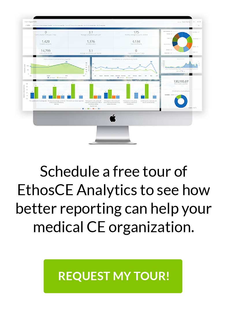
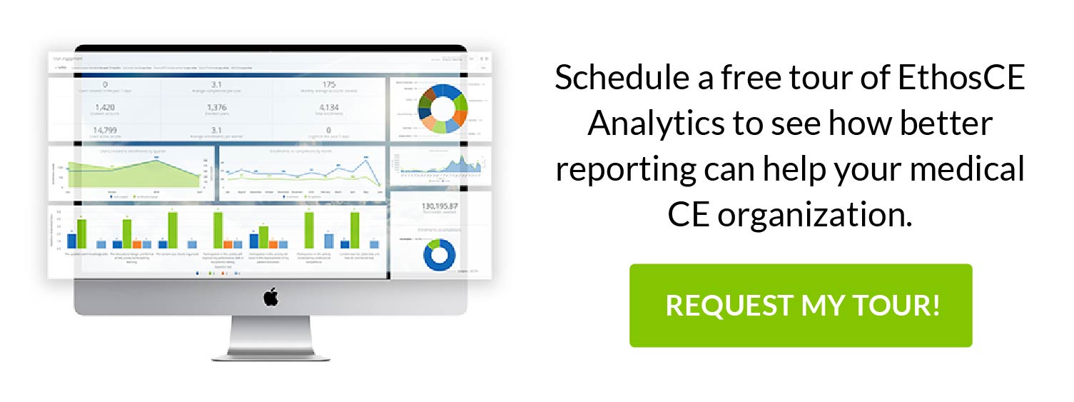
Even if it isn’t the singular reason that your learners are leaving your course, you’ve discovered that specific content is causing your students to disengage from the material and lose patience with your educational approach. Since you can look at visualizations of your data side-by-side, identifying context, patterns, and relationships within your data can take your team a workday (or less), rather than your entire workweek. If you are using an enterprise-grade CME management platform like EthosCE that comes bundled with a full-featured analytics suite, then you can auto-generate data visualizations from the insights that you’ve found, sharing them with your entire team with one click.
Do I Need All of This Data?
The key to data-driven decision-making is having easy access to the right data, and a simple method for quickly translating new information into plain language insights. A data visualization does just that. However, knowing which data is essential to educational strategy building—and should be included in your data visualization—can be a challenge. While every CME director may need to analyze different types of data to craft customized solutions for the unique needs of their programs, some essential data sets shouldn’t be left unexamined. Here are just a few:
Aggregate Course and Learner Data
- Course completion rates by activity
- Course completion rates by area of expertise and years of professional experience
- Historical and real-time learner assessment statistics
- Learner feedback post-course
- Pre-course learner survey data
Granular Course and Learner Data
- Performance per activity by strong learners
- Performance per activity by struggling learners
- Learner outcomes according to years of professional experience, level of education, and familiarity with the LMS platform
With EthosCE, you have a 360-degree view of your course and learner data from every level of your program’s operations. Our LMS allows you to view insights in real-time through customizable dashboards that show you the context, patterns, and relationships within your data that you need to create enduring course management solutions. At EthosCE, we have more than 16 years of experience empowering CME directors to create thriving educational programs that engage and inspire their learners. Ready to unlock the power of your data?
If you’d like to learn more about how EthosCE may be the right LMS for you, feel free to request a 1-on-1 walkthrough with one of our experts today.
 We're now part of the Cadmium product suite! Learn more

